


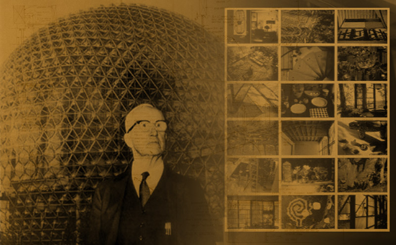
When looking for a climax to American Modernism the National Exhibition in Moscow in 1959 is a satisfying choice. The exhibition grounds in Sokolniki Park were gigantic and it hosted every modern appliance and comfort that the United States Industrial complex could muster. The crowning achievement in cultural exhibition was a multiple screen installation called, “Glimpses of the United States” projected inside the brand new geodesic dome designed by Buckminster Fuller. The simultaneously projected images in Glimpses produced by Charles and Ray Eames at the request of George Nelson had only one precedent, the Art X demonstration first assembled these collaborators. Close to three million people piled into this unique space to witness a technological marvel, but meanwhile they learned about the lives of everyday Americans. The multiple images communicated what no normal lecture could, photographic proof of highways and houses and automobiles but also families kissing each good bye in the morning and kissing each other good night at the end of the day. A modern marvel of technology was being used to teach its overseas audience about the humanity of their rivals. According to the critics, the Nelson-Eames method of multimedia presentation was the “smash hit of the Fair,’ according to Time Magazine. The Wall Street Journal described it as the “real bomb shell,” and the U.S. officials believed this was “the real pile driver of the fair.” (Colomina)
In 1959, mutual nuclear annihilation was a very real concern. The two major world powers decided to stage a two part cultural exchange show and The United States Information Agency chose Herman Miller’s George Nelson to design their exhibition.
Beatriz Colomina in her essay “Enclosed by Images: The Eameses’ Multimedia Architecture,” claims that this show, The Mosnow Exhibition was a critical moment in the history of the screen and that Charles Eames’ film “Glimpses of the United States came together as a direct result of the Art X show seven years earlier.
The U.S.A. and U.S.S.R. displayed their “science, technology, and culture” by taking turns. The Soviet edition opened in the New York Coliseum at Columbus Circle in New York City in June while the American installment opened in Sokolniki Park in Moscow in July of the same year.
The visitors were enchanted and the images they saw would be their concept of America. All the while the threat of war loomed. The show had multiple origins the U.S.I.A. had already joined forces with Museum of Modern Art to produce a show in Stuttgart, Germany in 1950. The proud display of US industrial design was already in place and meanwhile “Art X” in Athens, Georgia had provided a prototype for the film presentation.
From here Nelson and Eames would have a unique role as designers to the State: Nelson would go on to give his “Design to Kill” lecture on CBS to a national audience. While Eames would design an exhibit for the US Science Exhibit in Seattle in 1962 and in 1964 he designed the the IBM Ovoid Pavilion and the film presentations in it at the New York World’s Fair.
For GLIMPSES seven twenty-by-thirty foot screens were suspended din Buckminster Fuller’s golden dome. This depicted “a typical work day” in the life of the United States in nine minutes, and a “typical weekend day.” Thousands of images were pulled form photo archives of Magazines, as well as individual photographers Ferenc Berko, Julius Shulman, Ezra Stoller, Ernst Braun, George Zimbel, and Charles Eames) and friend of the committee including Eliot Noyes, George Nelson, Alexander Girard, Eero Saarinen, Billy Wilder, Don Albinson, and Robert Staples.
Fuller later claimed that “no one had done anything like this before that advertisers and filmmakers would soon follow the Eameses.” The Eameses were involved in all stages of the exhibit, as soon as George Nelson was hired byJack Masey (USIA).
In addition to GLIMPSES, the USIA had also contracted for the inclusion of Disney’s “Circarama.” A 360 degree motion picture which offered a twenty minute tour of American cities and tourist attractions and which played to about one thousand Russians an hour, an architecture exhibit, curated by Peter Blake, a fashion show curated by Eleanor Lambert, a packaging exhibition by the Musum of Modern Art’s associate curator of design, Mildred Constantine, and Edward Steichen’s famous photographic exhibit, “The Family of Man.” The exhibition also included a full scale ranch style suburban house, furnished by Macy’s.
The multi screen exhibit was second only to the cars and color televisions in terms of interest. TIME magazine called it the “smash hit of the Fair.” The WALL STREET JOURNAL described it as the “real bomb shell,” and the U.S. officials believed that it was “the real pile driver of the fair” Groups of five thousand people were brought into the dome every forty-five minutes, sixteen times a day, for the duration of the fair. Close to 3 million people saw the show and the floor had to be resurfaced three or four times during the six-week exhibition.
The Eameses were developing a new kind of space, one that negates traditional perspective, and one that incorporates technology its vocabulary is telescopes, zoom lenses, airplanes, night visions cameras, and so on, and where there is no privileged point of view. There is no individual images that make up GLIMPSES, “the images re-enacts the operation of the technologies.”
The film starts with images from outer space on all the screens: stars across the sky, seven constellations, seven star clusters, nebulae, etc, then moves through the aerial views of the city at night, from higher up closer in until city lights from the air fill the screens. The early morning comes with aerial views of landscapes from different parts of the country: deserts, mountains, hills, seas, farms, suburban developments, urban neighborhoods, When the camera eyes finally descend to the ground, we see close-ups of newspapers and milk bottles at doors. But still no people, only traces of their existence on earth.
Not by chance, the first signs of human life are centered upon the house and domestic space. From the stars at night the aerial views, the camera zoom to the most intimate scenes: “people having breakfast at home, men leaving for work, kissing their wives, kissing the baby, being given lunchboxes, getting into cars, waving good bye, children leaving for school, being given lunchboxes, saying good bye to dog, piling into station wagons and cars, getting into school buses, baby crying.
Like in POWERS OF TEN, the scene takes you from outer space, to everyday life of “last sips of coffee” “Children washing their hands before dinner.” “Housewives on the phone with clerks (supermarket food shelves), and so on.
Colomina draws a poignant comparison between POWERS OF TEN which was commissioned by The Commission of College Physics and GLIMPSES which was commissioned by the USIA, they both give context of the world and our place in it, yet one was used to create a concrete model of distance and scale and one was used to orient the viewer towards a different culture.
Colomina claims that the Eames method did not give his audience a new mode of seeing things, but a new mode of perception. GLIMPSES “breaks with the linear narrative of film to bring snippets of information, an ever-changing mosaic image of American life.” The message is still clear, consistent with the Kitchen Debate message of Nixon. The stars in the beginning, to the people kissing their good nights and the forget me not flowers in that last image, the film emphasized universal emotions while reinforcing the material abundance of one country.
significance.
The three designers on the committee designed a 55 minute lesson, a typical class. The subject was “Communication” and the goals was to break down the barriers between fields of learning, making people a little more intuitive.
Eames would continue using and refining his use of still photography to create slide show portraits. In his film “House: After Five Years of Living” thousands of color slides taken over five years combined, his technique was called, “Fast cutting” and it won an Emmy Award in 1960.
In Michael Braune wrote about the peculiar advantage of the Eames style.
“The interesting point about this method of film making is not only that it is relatively simple to produce and that rather more information can be conveyed that when there is movement on the screen, but that it corresponds surprisingly closely with the way in which the brain records the images it receives. I would assume that it also corresponds rather closely with the way Eames’s own thought processes tend to work. I think it symptomatic, for instance, that he is extremely interested in computers,… and that one of the essential characteristics of computers is their need to separate information into components before being able to assemble them into a large number of different wholes.”
Sample Lesson, was explained by the Eames in Vogue Magazine to be a kind of method of distraction, that permits the audience to experience a sense of relationships rather than a singular message.
For Glimpses, Charles explains that they wanted a practical number of images, a number that the audience could scan in the time allotted, yet with a large enough number that the actual number would not be consciously present. For instance we can conceive of seeing four images, but once you get to 8 images you are not so sure how many you saw. “They were very big image, the width across four them was half the length a football field.”
One journalist described it as “information overload” an avalanche of related data that comes too fast for him to cull and reject it. A twelve minute blitz.
They could not explain its subject in words, or in a linear way, so they would broadcast 50 images for ten seconds.
Later, at the Eames’ IBM exhibit, he used multiple screens in a new way, this time the screens were adjacent, in different shapes, and were not all carrying images simultaneously.
The eye cannot escape the screens; each screen is bordered by other screens. Fragments become momentarily linked. Theoretically, the way our brain works from glimpses and fragments, coasting in whichever ways possible on previous experience and bridging incomplete data streams, even dissociating.
In 1959, the exhibition was also called, “An information machine.” Inside the dome there was a RAMAC 305 computer an “electronic brain” which offered written replies to 3,500 questions about life in the United States. This is a precursor to the parallel structure call it ART Y, which maintains the individual points of data, which can be interpreted through the method.
The Eameses treated architecture as a multi channel information machine, and multimedia installation as just another kind of architecture.
Charles recognized his time as an era of communication in his lecture in 1950, communication displacing architecture. Yet, contending that information is architecture “The chairs are architecture, the films, they have a structure, just as a front page of the newspaper has a structure. The chairs are literally like architecture in miniature…architecture you can get your hands on.”
Talking about a storage design, “The details are not details. They make the product. The connections. The connections. The connections.” Yet they reflected often on the impossibility of linear discourse. The structure of their exhibitions have been compared to a scholarly paper, loaded with footnotes, where “the highest level of participation consists in getting fascinated by the pieces and connecting them for oneself.” This coincidently describes the rationale behind two part system of the Basic Art Courses at UGA.
The Mies Van der Rohe’s exhibition at the Museum of Modern Art in 1947, was significant influence on this philosophy. The organizational system communicated better than any single object. (model, drawing, photograph.) “The significant thing seems to be the way in which Mies has taken documents of his architecture and furniture and used them as elements in creating a space that says, “this is what it’s all about.”
Charles and Ray Eames wrote extremely detailed notes on the running of their presentations, to regulate the flow of information and reduce noise from the system. They frequently drew diagrams and drawings which illustrated the rise and fall of intensity, or, more precisely, the existing space of the media that they wanted to intensify.
“Theoretically, it was a statement made by our State Department, and yet we did it entirely here and it was never seen by anyone from our government until they saw it in Moscow…If you ask for criticism, you get it. If you don’t there is a chance everyone will be too busy to worry about it.”
 |
 |
 |
 |
 |
 |
 |
 |
 |
 |
 |
 |